PCA is not magic
Interest in machine learning has skyrocketed in the last few years. In response to that interest, many educational resources detailing how to get started have popped up, ranging from courses and textbooks to tutorials. Some take a first-principles approach, where the student is guided through the derivation of the key building blocks of machine learning. These resources tend to be relatively heavy with math, and potentially inaccessible to those without the right background. Other resources are more applications-focused, and aim to get the student up and running as quickly as possible.
I find myself pretty conflicted over which approach to favour, or more precisely, where the best point is on that tradeoff frontier. Machine learning is difficult, complicated, and highly mathematical – first-principles knowledge can be invaluable in selecting an appropriate model, in selecting features, in debugging issues with training, overfitting, and so on. Yet you can spend as much time as you want preparing to practise machine learning - how much do you actually need? Is it really necessary to implement backprop before you have earned the right to use Keras? Isn’t there a lot of practical knowledge involved in machine learning that is better understood with experience?
Both approaches have their merits. But there’s one thing that I feel strongly about: it is critical to show the student where the model or technique breaks down. What types of problems does it struggle with? Is there anything that breaks it completely?
When this is missing, the lesson becomes dangerously misleading – it shows off how cool and great a given technique is, as if it’s a piece of magic. As if it would work anywhere.
As an example, let’s look at this article from Setosa on PCA. (As an aside, I’m picking on this article since it’s of reasonably good quality in other respects. There are plenty of poorly written, wholly uninformative articles out there, but choosing one of those would obscure the particular thing I want to address.) This article has a nice explanation of what PCA is, eschewing equations for a pretty apt metaphor of “finding a camera angle” that best reveals patterns in the data. And it even has an interactive PCA demo on some 2D data.
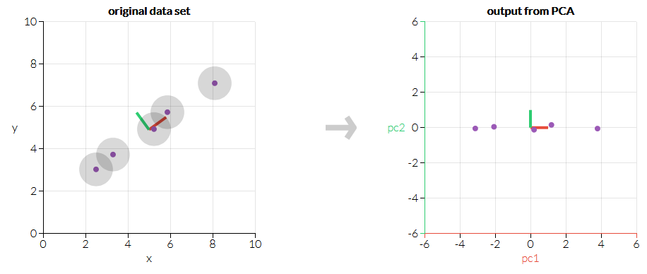
The demo shows PCA picking out how all the data points fall more or less on a line. PC1 gets assigned to how far along the line a data point is. PC2 is much less interesting, so we could theoretically drop it and be left with 1D data that contains almost all the relevant info we had before.
The article ends shortly after this. If you were unfamiliar with PCA before, but made it to the end of this brief article, you probably feel like you understand the basics of what PCA does. If that’s the case, perhaps you’d care to make a quick prediction. If we apply PCA to the following set of data, what directions would it choose for the principal axes?
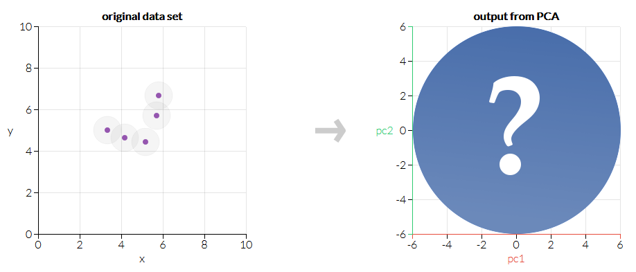
Have you made a guess? I promise it’s worth your time. At least, it is if you care about PCA.
Here’s the result:
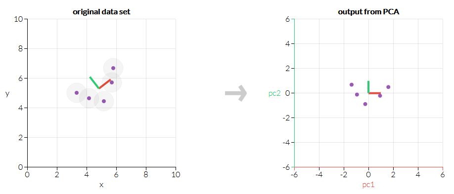
If you feel any confusion upon seeing this outcome, you are missing a key piece of what PCA is. Luckily for you, this is the ideal moment to learn. Go back to the interactive demo, and play around some more. (If you need a hint, try to imagine drawing an ellipse around the data. What direction does the ellipse point if you try to get the longest and skinniest ellipse you can? Which arrangements of the data points can pack tightly into the ellipse, and which leave a lot of space? This is a rather fuzzy way to think about PCA, but in my opinion it pays the rent, while “it finds patterns in the data” just doesn’t.) Or look into the math a bit more if that works for you.
Good educational writing should be appealing enough to justify itself. If the target audience cannot (or does not want to) finish a piece, then obviously the writing has failed. But the audience must still be challenged, even if gently so. If they could be disappointed, then perhaps they should be. Showing only positive examples and having the audience nod along only conveys the illusion of understanding. It is by seeing the failure modes of a technique that its seams are laid bare and a deeper understanding is gained. In my opinion, this is pretty practical knowledge to have, too.
If you were patiently hoping to see a counterexample of what I’m talking about, then you’re already getting the hang of this. I like this article about t-SNE, another technique used for dimensionality reduction. It also has an interactive demo, but it squeezes a lot more out of it, providing more guidance as to what the reader might want to try and discussing a lot of interesting examples, including one where the author deliberately feeds meaningless noise into t-SNE and shows how it can trick you with meaningful-looking visualizations.
At the end of the day, tools like PCA and t-SNE have tradeoffs and weak points. Getting the most out of them requires understanding where they fail, and avoiding that discussion is thoroughly counterproductive. So if you’re learning how to use a new technique, try and figure out how to break it. And if you want to teach it, make sure to guide your students through that process. Because otherwise, the confidence and “understanding” gained is as stable a foundation as the hype train it rode in on.